


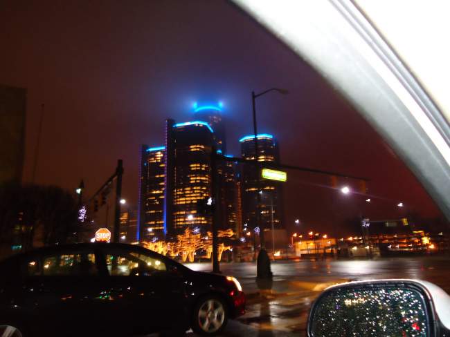
I noticed new lighting on the elevator shafts and happened to have my camera next to me
Results 1 to 25 of 26
Thread: New RenCen lighting
-
December-23-11, 03:21 PM #1
 DetroitYES Member
- Join Date
- Jul 2009
- Posts
- 776
 New RenCen lighting
Last edited by MSUguy; December-23-11 at 04:05 PM.
-
December-23-11, 03:47 PM #2
DetroitYES Member
- Join Date
- Mar 2009
- Posts
- 7,681
It was red the other day. Why do the colors change?
-
December-23-11, 03:52 PM #3
DetroitYES Member
- Join Date
- Jul 2011
- Posts
- 1,325
They were pink back in October for Breast Cancer awareness. Red might be for Christmas colors or something. The usually change the colors and logos to correspond to holidays/events since, essentially, they're giant led TVs.
-
December-23-11, 04:16 PM #4
DetroitYES Member
- Join Date
- Nov 2009
- Posts
- 271
Red Wings.
-
December-23-11, 04:27 PM #5
DetroitYES Member
- Join Date
- Dec 2011
- Posts
- 2
Sure looks expensive...
-
December-23-11, 04:31 PM #6
DetroitYES Member
- Join Date
- Mar 2009
- Posts
- 5,863
The red was for Paint the City Red day yesterday; to drum up donations for the Salvation Army bell ringers. Motor City Casino/Hotel's stripes were red too, as well as Salvation Army giving away Red Velvet cupcakes.
-
December-24-11, 12:22 AM #7
DetroitYES Member
- Join Date
- Mar 2009
- Posts
- 779
Since I think it's looks pretty cool it doesn't bother me I helped pay for it... Originally Posted by MrsPhoenix

-
December-24-11, 01:22 AM #8
DetroitYES Member
- Join Date
- Mar 2009
- Posts
- 5,433
Because they can?! Little birdie tells me there is more coming, too. We will consider this understated soon. At the moment, despite my initial poor reaction to these, I like 'em. Puncuates the skyline. Cheers! Originally Posted by Detroitnerd
-
December-24-11, 08:45 AM #9
DetroitYES Member
- Join Date
- Apr 2009
- Posts
- 1,684
That photo doesn't do it justice. Those are actually horizontal concentric rings on every floor of each elevator cylinder. I'll try to get another photo. These lights are relative new. They weren't around in October when the rings on top of the towers were pink.
-
December-24-11, 09:07 AM #10
DetroitYES Member
- Join Date
- Mar 2009
- Posts
- 5,863
I'm betting on Honolulu Blue and Silver later today.
-
December-24-11, 09:34 AM #11
DetroitYES Member
- Join Date
- Apr 2009
- Posts
- 835
I like it. Very cool.
LEDs are great. Majority of my house has had them for about a year now and the savings has been very noticeable. Welcome to the 21st CE.
-
December-24-11, 12:40 PM #12
DetroitYES Member
- Join Date
- Apr 2011
- Posts
- 30
Awesome lights. It really makes our skyline look futuristic.
Last edited by I <3 DET; December-24-11 at 12:42 PM.
-
December-24-11, 01:22 PM #13
DetroitYES
- Join Date
- Feb 2009
- Posts
- 6,831
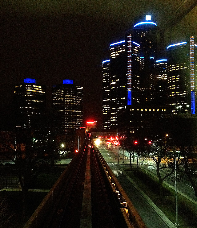
From the front window of the People Mover exiting the Bricktown Station.
-
December-24-11, 02:08 PM #14
DetroitYES Member
- Join Date
- Jul 2011
- Posts
- 1,325
Oh wow I had even noticed those. And the two photos above this post really makes the Ren Cen look like a Christmas tree. Originally Posted by downtownguy

-
December-24-11, 03:09 PM #15
DetroitYES Member
- Join Date
- Apr 2009
- Posts
- 835
The RenCen has always been on my top five list of completely horrific architecture [[inside and out) and this is THE best lipstick on a pig I have ever seen.
The building actually looks tolerable.
-
December-24-11, 03:23 PM #16
DetroitYES Member
- Join Date
- Mar 2009
- Posts
- 9,504
You must not travel much.... South America, Asia, and Europe are littered with hundreds of abominations... such as these... Originally Posted by Baselinepunk

-
December-24-11, 03:38 PM #17
DetroitYES Member
- Join Date
- Apr 2009
- Posts
- 835
Yikes! But still, the RenCen is just plain ole fuggly..
-
December-24-11, 08:19 PM #18
DetroitYES Member
- Join Date
- Mar 2009
- Posts
- 9,504
lol.... I found that image on this website.... but be forewarned... there are some really "butt ugly" tall buildings around the world... although in your defense, they do show the RenCen at around page 50 of this thread... Originally Posted by Baselinepunk
http://www.skyscrapercity.com/showthread.php?t=524747
-
December-24-11, 08:29 PM #19
DetroitYES Member
- Join Date
- Oct 2009
- Posts
- 1,557
The city of Groningen had a somewhat organic shaped building for the Gasunie, one of the biggest gas transfer companies in the world. They control almost half of Europe's gas transport network up to Russia.

It's even more amazing from the inside.
It's not that large compared to US standards but it can be seen for miles and miles.
-
December-24-11, 09:05 PM #20
DetroitYES Member
- Join Date
- Apr 2009
- Posts
- 835
Gistok
There is really bad shit everywhere. But how much of that "functional" architecture posted was supposed to be a "revitalization" of their city?
lol. Most of that, if you changed a few colors, would be nothing more than what one would see in contemporary New York.
Yes, I said it. NEW YORK!!!
-
December-25-11, 12:49 PM #21
DetroitYES Member
- Join Date
- Dec 2009
- Posts
- 1,797
I saw the vertical lighting for the first time last night. Looks pretty good IMO. As long as that's it and it doesn't get carried away.
-
December-27-11, 02:58 AM #22
DetroitYES Member
- Join Date
- Jul 2009
- Posts
- 583
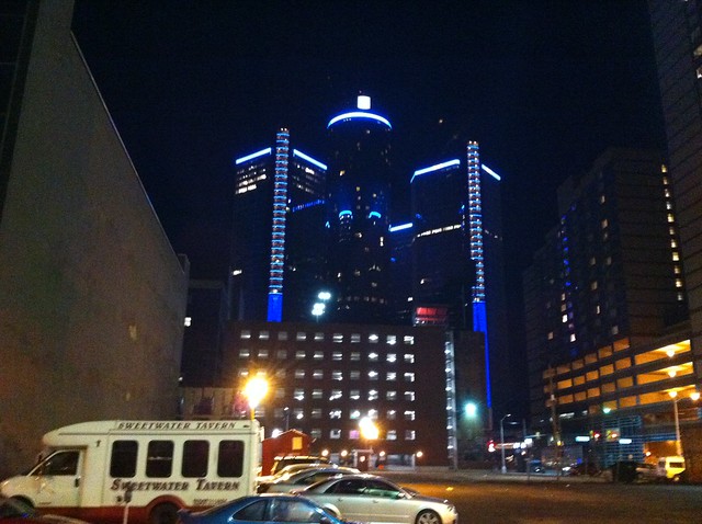
VView from St. Andrew's Hall
-
December-27-11, 03:26 PM #23
DetroitYES Member
- Join Date
- Apr 2009
- Posts
- 70
I love the lighting on the RenCen. I live on Lafayette and look forward to seeing the colors every night when I go home from school or my studio.
-
December-27-11, 04:04 PM #24
DetroitYES Member
- Join Date
- Mar 2009
- Posts
- 891
Look like someone is on a Tron kick.

I've always loved the interior of the Ren Cen. It's part Death Star and something else. One of my fondest memories is sitting in the restaurant downstairs with the "wishing pond".
-
December-27-11, 06:51 PM #25
DetroitYES Member
- Join Date
- Aug 2009
- Posts
- 125
Subjective.
I do agree that there are some not so attractive buildings out there. But it's a subjective argument. The Rec Cen falls under that bracket. It's not the most attractive building, but I wouldn't say that it is ugly. It's more boring that unattractive imo.

 Reply With Quote
 Posting Permissions
Instagram
DetroitYES navigation
DetroitYES Management
© AtDetroit LLC 2000 - 2024 unless otherwise specified. Please notify us of uncited proprietary content.
Welcome to DetroitYES! Kindly Consider Turning Off Your Ad BlockingX
DetroitYES! is a free service that relies on revenue from ad display [regrettably] and donations. We notice that you are using an ad-blocking program that prevents us from earning revenue during your visit.
Ads are REMOVED for Members who donate to DetroitYES! [You must be logged in for ads to disappear]
Ads are REMOVED for Members who donate to DetroitYES! [You must be logged in for ads to disappear]
DONATE HERE »
And have Ads removed.
And have Ads removed.
Bookmarks