


Some might say the current Detroit Flag is too complex, with too many colors, and the city seal shouldn’t be on it.
https://youtu.be/H5zHTZGDfnM
Results 1 to 25 of 44
Thread: Detroit needs a new flag ?
-
September-29-18, 11:35 AM #1
 DetroitYES Member
- Join Date
- Mar 2017
- Posts
- 1,639
 Detroit needs a new flag ?
-
September-29-18, 12:32 PM #2
 DetroitYES Member
- Join Date
- Mar 2009
- Posts
- 8,206
I was skeptical at first but he did a good job. He put a lot of thought into that and came out with a good design.
It reminded me of this surprisingly interesting 18-minute video on flag design:
Why city flags may be the worst-designed thing you've never noticed.
-
September-29-18, 01:01 PM #3
DetroitYES Member
- Join Date
- Mar 2009
- Posts
- 3,866
That was a super video! Great chuckles! Originally Posted by Jimaz

Made me look up the City of Las Vegas flag; fairly simple but has the dang city seal with writing on it, so put us on the bottom half as Detroit.
-
September-29-18, 01:21 PM #4
DetroitYES Member
- Join Date
- Aug 2009
- Posts
- 2,222
I’d say just remove the seal from the current flag.
-
September-29-18, 02:01 PM #5
DetroitYES Member
- Join Date
- Mar 2009
- Posts
- 8,206
I remembered it from this other related DYES! thread: Making Detroit's Flag Our Symbol. Originally Posted by Ray1936
I found this: Originally Posted by Ray1936

-
September-29-18, 02:37 PM #6
DetroitYES Member
- Join Date
- Mar 2009
- Posts
- 3,866
Oh, that's a yuck flag. Never even saw it before. I'll have to work on that. Originally Posted by Jimaz

Edit: Just sent the link and my thoughts along to Debra March, Mayor of Henderson. She's a friend of mine. Her father, John March, served 25 years on the Detroit PD.Last edited by Ray1936; September-29-18 at 02:44 PM. Reason: Brain storm
-
September-29-18, 03:52 PM #7
DetroitYES Member
- Join Date
- Mar 2017
- Posts
- 1,639
What the symbols mean and why they were chosen
https://web.archive.org/web/20040420070515/http://www.detroithistorical.org/learningcenter/curriculummaterials/detroitsstory/a1.pdf

Last edited by O3H; September-29-18 at 03:55 PM.
-
September-29-18, 04:04 PM #8
DetroitYES Member
- Join Date
- Jun 2015
- Posts
- 1,416
99% Invisible host Roman Mars did an excellent podcast on city flag design, a Ted Talk about terrible city flag design, and an even better follow up on fixing bad city flag design [[with an article and lots of examples for illustration). You can find it all here:
Vexillology Revisited: Fixing the Worst Civic Flag Designs in America
https://99percentinvisible.org/artic...signs-america/
-
September-29-18, 04:36 PM #9
DetroitYES Member
- Join Date
- Mar 2017
- Posts
- 1,639
It's 2018+ , time for Detroit to move forward with strong symbolism.
As we have found out, auto's isn't going to get it done, let's move on.
Perhaps this image, this symbol, and no words on a white background.

Last edited by O3H; September-29-18 at 04:38 PM.
-
September-29-18, 05:37 PM #10
DetroitYES Member
- Join Date
- Apr 2009
- Posts
- 4,513
I LOVE our city flag. Colorful, eye-catching, unique, and with a back story of our long history as the oldest major city in the midwest. I have it hanging in my office, I have a screen saver of it, I have a sticker of it on my car, I drink my coffee every morning out of a cup with our flag on it. Originally Posted by O3H
I vote very strongly in favor of keeping it.
-
September-29-18, 10:10 PM #11
DetroitYES Member
- Join Date
- Mar 2009
- Posts
- 3,866
The flag would be perfect if only the city seal were removed from the center. Hey, just sayin'.
-
September-30-18, 06:35 PM #12
DetroitYES Member
- Join Date
- Mar 2017
- Posts
- 1,639
I think it needs updating - toward something more modern - not medieval
-
October-01-18, 08:29 AM #13
DetroitYES Member
- Join Date
- Dec 2012
- Posts
- 10
It doesn't need "fixing." It isn't medieval. But tradition does say "we've been here a long time; we're going to continue to be here, and we value where we came from." If you have to be taught to hate what you have, then there really isn't anything wrong with what you have. You're just letting them rob you of your heritage. Andy Warhol symbols are meaningless except to those who conjure them up and explain to you what they mean.
-
October-01-18, 09:45 AM #14
DetroitYES Member
- Join Date
- Feb 2012
- Posts
- 1,412
His design is thoughtful, but I think a little stark. The current flag is interesting but is a bit busy.
I've always thought the English [[and probably a lot of other Europeans, an even the Canadians to an extent) do an almost uniformly good job with their local flags. Then again, they've been doing it for over a thousand years and we pretty much ditched heraldry with the revolution, so I think our republican-minded forebearers just started throwing random shit and words on flags. Kind of a lost art here. It is worth noting that the complicated Detroit flag design makes it very expensive to produce and purchase, too.
https://en.wikipedia.org/wiki/List_of_English_flags
-
October-01-18, 09:48 AM #15
DetroitYES Member
- Join Date
- Apr 2009
- Posts
- 4,513
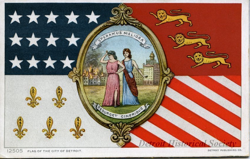
I don't know.... the hope of Speramus Meliora - Resurget Cineribus seems pretty much as apt today as it must have back in 1805. Originally Posted by Ray1936
-
October-01-18, 10:22 AM #16
DetroitYES Member
- Join Date
- Mar 2009
- Posts
- 3,866
Originally Posted by EastsideAl
Excellent point.
-
October-01-18, 12:38 PM #17
DetroitYES Member
- Join Date
- Dec 2011
- Posts
- 338
Of course. Problem is that writing or lettering of any kind shouldn't be on a flag. Fine for a seal, but not on fabric that's flapping in the wind 100 feet away. Originally Posted by EastsideAl
I'm glad that people are waking up to bad flag design. Pocatello ID recently got a new flag. Check out the old monstrosity and the cool new one:

-
October-01-18, 06:21 PM #18
DetroitYES Member
- Join Date
- Apr 2009
- Posts
- 4,513
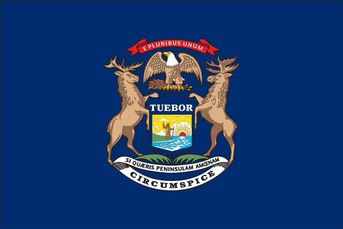
To that argument I say: Tuebor! Originally Posted by Király
-
October-01-18, 06:57 PM #19
DetroitYES Member
- Join Date
- Jan 2010
- Posts
- 4,867
I agree with Eastside Al [[not much else we see eye-to-eye on) that the flag tells our story and that the seal on the flag is pretty much traditional for most states and a lot of cities.
-
October-01-18, 07:15 PM #20
DetroitYES Member
- Join Date
- Mar 2017
- Posts
- 1,639
Interesting how we never learned about about any flag for Detroit
even after all those years of public school education + university.
Honestly, I just heard about it a week ago. Never knew it existed before
-
October-01-18, 07:55 PM #21
DetroitYES Member
- Join Date
- Mar 2009
- Posts
- 9,465
Hehehe..... the new flag looks like a South Park design..... Originally Posted by Király

-
October-01-18, 08:53 PM #22
DetroitYES Member
- Join Date
- Apr 2009
- Posts
- 4,513
It's been on display at the Detroit Historical Museum for as long as I can remember. Originally Posted by O3H
The original version had a much larger seal in the middle
Last edited by EastsideAl; October-01-18 at 08:58 PM.
-
October-01-18, 09:28 PM #23
DetroitYES Member
- Join Date
- Apr 2009
- Posts
- 4,513
Here is a link to a fascinating 1972 issue of Michigan Jewish History almost entirely dedicated to the story of David Heineman, who was the designer of the flag of the City of Detroit, and also a state legislator, member of the Common Council, City Controller, and instrumental in the founding of the DIA and the Detroit Public Library.
https://www.michjewishhistory.org/as...ry_1972_06.pdfLast edited by EastsideAl; October-02-18 at 11:37 AM.
-
October-02-18, 07:45 AM #24
DetroitYES Member
- Join Date
- Jun 2009
- Posts
- 440
I always found our flag to literally define what we are at present. When people come here and they would take a look at our flag, it shows that we have a history, and unfortunately we're right now at the part where are city is trying to pull itself together.
A new flag would make most people ignore the history that we have.
As much as I would like to applaud those that would like to change the flag. I think it would be best to teach those the importance of what that flag means to this city.
-
October-02-18, 09:05 AM #25
DetroitYES Member
- Join Date
- Jun 2009
- Posts
- 1,732
If they are already in Detroit odds are that they either know Detroit has a history or they can see it as they are walking around. What is hard to see or decipher is the current flag with the seal in the middle. I would also argue that a change in design would do more for bringing awareness to the flag and history than what we are doing now. Most people don't know we have a flag... Originally Posted by Tig3rzhark
As for design I found this one online some time ago that I think would be a nice alternative. It is simple and still conveys the history of the city without the MS Paint looking figures on it. It is also bold and could serve as a source of pride and branding much like Chicago's flag.

 Reply With Quote
 Posting Permissions
Instagram
DetroitYES navigation
DetroitYES Management
© AtDetroit LLC 2000 - 2024 unless otherwise specified. Please notify us of uncited proprietary content.
Welcome to DetroitYES! Kindly Consider Turning Off Your Ad BlockingX
DetroitYES! is a free service that relies on revenue from ad display [regrettably] and donations. We notice that you are using an ad-blocking program that prevents us from earning revenue during your visit.
Ads are REMOVED for Members who donate to DetroitYES! [You must be logged in for ads to disappear]
Ads are REMOVED for Members who donate to DetroitYES! [You must be logged in for ads to disappear]
DONATE HERE »
And have Ads removed.
And have Ads removed.
Bookmarks