

Nah, they're going to take it down every time it rains or snows, or when it drops below 50 degrees.Originally Posted by Hypestyles

Results 26 to 33 of 33
-
July-22-15, 09:33 AM #26
 DetroitYES Member
- Join Date
- Oct 2012
- Posts
- 774

-
July-22-15, 11:07 AM #27
DetroitYES Member
- Join Date
- Dec 2009
- Posts
- 1,785
Originally Posted by southen
And Thank you very much. My brain was not working this morning when I wrote that.
-
July-22-15, 12:27 PM #28
DetroitYES Member
- Join Date
- Aug 2012
- Posts
- 8,856
Think of all the jobs that'll create.... Originally Posted by Spartan
-
July-22-15, 05:00 PM #29
DetroitYES Member
- Join Date
- Mar 2009
- Posts
- 5,433
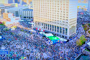
Geez, in what universe does this display "look great"?!
Firstly, it is mounted roughly ten feet too far to the right. Parked at the curb by the ol' Ponch, the screen is cut off by the light poles. Even with these images, it is clear that it isn't even centered in the monkey bars.
Whomever planned the whole diagonal framing is simply an idiot. Sorry.
I obviously thought for a while that the actual video panels would be diagonal, too...hence my concerns about introducing extraneous video processing mathematics to map it.
But what we've got might be worse...permanent diagonal interference from BOTH sides of this see-through display. They obviously wanted the see-through feature, since it is one of the high-lighted terms in the press release, but the design team really dropped the ball by introducing such clutter.
Makes the image really tough to comprehend.
I imagine that making the diagonal bars reflective chrome might help a bit, reducing the diagonal blockage to mere shadows. That would still be putting lipstick on a pig.
Plus, the glass over the image reflected so much yesterday morning that it made the screen basically disappear. Some simple non-glare coating would've helped that.
I'm sure they can get around the Federal restrictions over advertising near a highway, since the People Mover track bisects the image as seen from Woodward. There is too much between the screen and that intersection for it to be a worry.Last edited by Gannon; July-22-15 at 05:03 PM.
-
July-22-15, 05:31 PM #30
DetroitYES Member
- Join Date
- Mar 2009
- Posts
- 1,911
I really don't understand all the framing behind it. Is it functional in some way? It just looks a bit... odd to me.
-
July-23-15, 09:09 AM #31
DetroitYES Member
- Join Date
- Mar 2009
- Posts
- 5,433
Yeah, I don't see anything else on the entire building that is diagonal.
-
July-23-15, 09:59 AM #32
DetroitYES Member
- Join Date
- Aug 2012
- Posts
- 8,856
I've seen that diagonal girder style of architecture in and on other buildings before. It's one of these "trendy" looking designs.
-
July-23-15, 10:42 AM #33
DetroitYES Member
- Join Date
- Mar 2009
- Posts
- 4,533
I agree. When I first saw it being erected I thought the video screen was going to take up the entire area and would be really impressive. It looks like it was done as a cheap way to modernize the old façade. Originally Posted by old guy

 Reply With Quote
 Posting Permissions
Instagram
DetroitYES navigation
DetroitYES Management
© AtDetroit LLC 2000 - 2024 unless otherwise specified. Please notify us of uncited proprietary content.
Welcome to DetroitYES! Kindly Consider Turning Off Your Ad BlockingX
DetroitYES! is a free service that relies on revenue from ad display [regrettably] and donations. We notice that you are using an ad-blocking program that prevents us from earning revenue during your visit.
Ads are REMOVED for Members who donate to DetroitYES! [You must be logged in for ads to disappear]
Ads are REMOVED for Members who donate to DetroitYES! [You must be logged in for ads to disappear]
DONATE HERE »
And have Ads removed.
And have Ads removed.
Bookmarks