


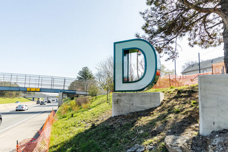
I love the idea. I just wish they could have elevated it a little higher than arms-reach. It's an easy target on only a two-foot base. Growing up in Southwest, I hope it doesn't get spray painted F*** You, or B****h, or gang symbols 6 hours after it's installed. Gang members love high profile things showing off "who's hood this is." Let's pray it doesn't embarrass us as the Draft Fans roll into town.
I keep thinking about the Rock on WSU campus that gets repainted....and repainted...and repainted [[by different groups) daily it seems! LOL
Opinions?
Results 1 to 25 of 31
Thread: New Detroit Signs: Opinions
-
April-09-24, 03:52 PM #1
 DetroitYES Member
- Join Date
- Nov 2017
- Posts
- 81
 New Detroit Signs: Opinions
Last edited by casscorridor65; April-09-24 at 03:57 PM.
-
April-09-24, 07:51 PM #2
DetroitYES Member
- Join Date
- Jan 2013
- Posts
- 541
It's fine. I think it would look better elevated over the roadway, but yea I know there are rules about stuff like that.
It would be nice if this had been done with time for some proper mature plantings around it. As it is it looks like a last minute idea, which is exactly what it was.
-
April-09-24, 09:51 PM #3
DetroitYES Member
- Join Date
- Sep 2009
- Posts
- 904
Honestly, I kind of like it. It's getting crapped on, but it's fine and probably looks cool when you drive in.
Do agree with others...hope this doesn't get painted right away.
-
April-10-24, 07:14 AM #4
DetroitYES Member
- Join Date
- Mar 2009
- Posts
- 5,840
If they want to do it right, they will buy fully grown plants/flowers and put them in when it's all installed. By then they should live and it would look much nicer
 Originally Posted by DetroitSoldier

-
April-10-24, 09:41 AM #5
DetroitYES Member
- Join Date
- Aug 2017
- Posts
- 601
I'm pretty sure that's in the works. Greenery around the base shows in the rendering and I think there was a quote about it being part of the plan. Originally Posted by jcole
Detroit getting Hollywood-style sign ahead of 2024 NFL draft [[freep.com)“It’s going to be like the Hollywood sign, but smaller,” she said. “The letters will look like they are floating on beautiful greenery … and they will light up in Detroit’s colors, green and white.”
-
April-10-24, 09:53 AM #6
DetroitYES Member
- Join Date
- Jun 2009
- Posts
- 1,729
The problem is they compared it to arguable the most famous sign in the world. They oversold it and of course it was going to disappoint. If they simple said they were adding some signage to beautify the entry into the city nobody would complain. Instead those putting out the press release embarrassed themselves by going with the comparison that they did.
I don't mind it. I may have done something cooler for $400k but it isn't bad.
-
April-10-24, 10:52 AM #7
DetroitYES Member
- Join Date
- Aug 2017
- Posts
- 601
The City put out an almost perfectly accurate rendering upon the announcement back in February. It's also $400k for this sign and 6 other smaller signs at the City's borders. Way better than a blue bridge that sorta has a football shape to it. Originally Posted by southen
-
April-10-24, 11:12 AM #8
DetroitYES Member
- Join Date
- Feb 2010
- Posts
- 3,901
100% agree. Originally Posted by stinkytofu
People want to shit on everything because it's harder than actually trying to make a difference. Look at the golden ring on Hall Road and how everyone wants to say it looks like a booty-hole, when it doesn't. Sterling Heights adopted a theme for all of it's major corridors instead of just making them bland.
Ignore the haters. I dig the DETROIT sign!
-
April-10-24, 11:30 AM #9
DetroitYES Member
- Join Date
- Apr 2009
- Posts
- 573
agree with Wylie
-
April-10-24, 11:34 AM #10
DetroitYES Member
- Join Date
- Mar 2023
- Posts
- 115
I don't hate it either, but I think this would have worked better in a spot where visitors can actually get out and grab a pic for insta. Tourists love shit like that when they travel, but no one is pulling over on 94 here.
-
April-10-24, 12:19 PM #11
 DetroitYES Member
- Join Date
- Mar 2009
- Posts
- 8,173
Where the new Detroit sign sits on the 'stink scale'
It took several weeks for the letters to be built and then a few days for them to be installed, but now that its up, some people arent thrilled with the look.
-
April-11-24, 07:07 AM #12
DetroitYES Member
- Join Date
- Mar 2009
- Posts
- 5,840
I think it's just fine; a lot of people enter Detroit that way so it will be seen and it's not something every other city has. It just looks raw because it's brand new
-
April-11-24, 08:19 AM #13
DetroitYES Member
- Join Date
- Apr 2009
- Posts
- 120
I'm in the minority with the posts here - its in a bad location, almost certainly will be blocked by traffic, and undersized. I think it would have been better off on some overhang.
-
April-11-24, 08:46 AM #14
DetroitYES Member
- Join Date
- Mar 2009
- Posts
- 8,173
The letters are eight feet tall and will be lit {today} at night.
For me it's like the eclipse. I'm ambivalent. ¯\_{ツ}_/¯
-
April-11-24, 01:38 PM #15
DetroitYES Member
- Join Date
- Mar 2009
- Posts
- 1,106
Its a terribly designed thing. The letters, spacing, and orientation are a mess. There is no implied reference to the identity of the place. Its a real missed opportunity, but probably better than the 12x12 metal sign that announced your arrival in Detroit before. I just want to know who signed off on this design. Like, who thought, "Yeah, that is what's going to turn people on to Detroit!" That person shouldn't be making those decisions.
1953
-
April-11-24, 02:36 PM #16
DetroitYES Member
- Join Date
- Apr 2016
- Posts
- 84
Agreed. Toronto's version of this comes to mind. Tourists [[yours truly included) take photos there all the time. Originally Posted by gratiotfaced
Deisign opinions aside, Detroit's version is a textbook missed opportunity.
-
April-13-24, 10:19 AM #17
DetroitYES Member
- Join Date
- May 2010
- Posts
- 150
I like it. I would have made two changes: 1. Use the Tiger's Old English "D" which calls out the heritage of the City, and 2) Locate it in spot where someone can pull over and take a picture. A snapshot at the entrance sign is a popular choice of travelers.
-
April-13-24, 10:37 AM #18
DetroitYES Member
- Join Date
- Apr 2009
- Posts
- 3,387
They should have used the "Ole English D" for sure. That was a major gaffe.
-
April-13-24, 01:05 PM #19
DetroitYES Member
- Join Date
- Mar 2009
- Posts
- 8,173
Yes but then what about the other characters? Use Old English for those too? That might work. Originally Posted by Cincinnati_Kid
Old English text generator
-
April-13-24, 03:18 PM #20
DetroitYES Member
- Join Date
- May 2010
- Posts
- 150
No, I think just he initial "D" makes the statement.
-
April-13-24, 03:59 PM #21
DetroitYES Member
- Join Date
- Mar 2009
- Posts
- 5,840
I believe the Olde English D used by the Tigers is under copywrite. There are other Olde English Fonts our there but not identical to ours.
-
April-13-24, 05:55 PM #22
DetroitYES Member
- Join Date
- Mar 2009
- Posts
- 4,518
Somebody mentioned this in the Det. News comments and a few people responded you can't copyright the Olde English D but isn't that why they had to stop the D drop on New Year's Eve? Originally Posted by jcole
-
April-14-24, 03:31 PM #23
DetroitYES Member
- Join Date
- Jul 2009
- Posts
- 4,859
So, the funky D is a baseball thing and you want it for a football thing?
And hopefully the NFL paid for this roadside distraction that might cause accidents and not the taxpayers.
-
April-15-24, 07:57 AM #24
DetroitYES Member
- Join Date
- Jan 2023
- Posts
- 49
I like the new sign and it's better than nothing. It looks good passing it on I-94.
-
April-15-24, 11:01 AM #25
DetroitYES Member
- Join Date
- Mar 2009
- Posts
- 5,840
This is a variety of Old English D's;but the one the Tiger's trademarked in 2017 is not useable

 Reply With Quote
 Posting Permissions
Instagram
DetroitYES navigation
DetroitYES Management
© AtDetroit LLC 2000 - 2024 unless otherwise specified. Please notify us of uncited proprietary content.
Welcome to DetroitYES! Kindly Consider Turning Off Your Ad BlockingX
DetroitYES! is a free service that relies on revenue from ad display [regrettably] and donations. We notice that you are using an ad-blocking program that prevents us from earning revenue during your visit.
Ads are REMOVED for Members who donate to DetroitYES! [You must be logged in for ads to disappear]
Ads are REMOVED for Members who donate to DetroitYES! [You must be logged in for ads to disappear]
DONATE HERE »
And have Ads removed.
And have Ads removed.
Bookmarks